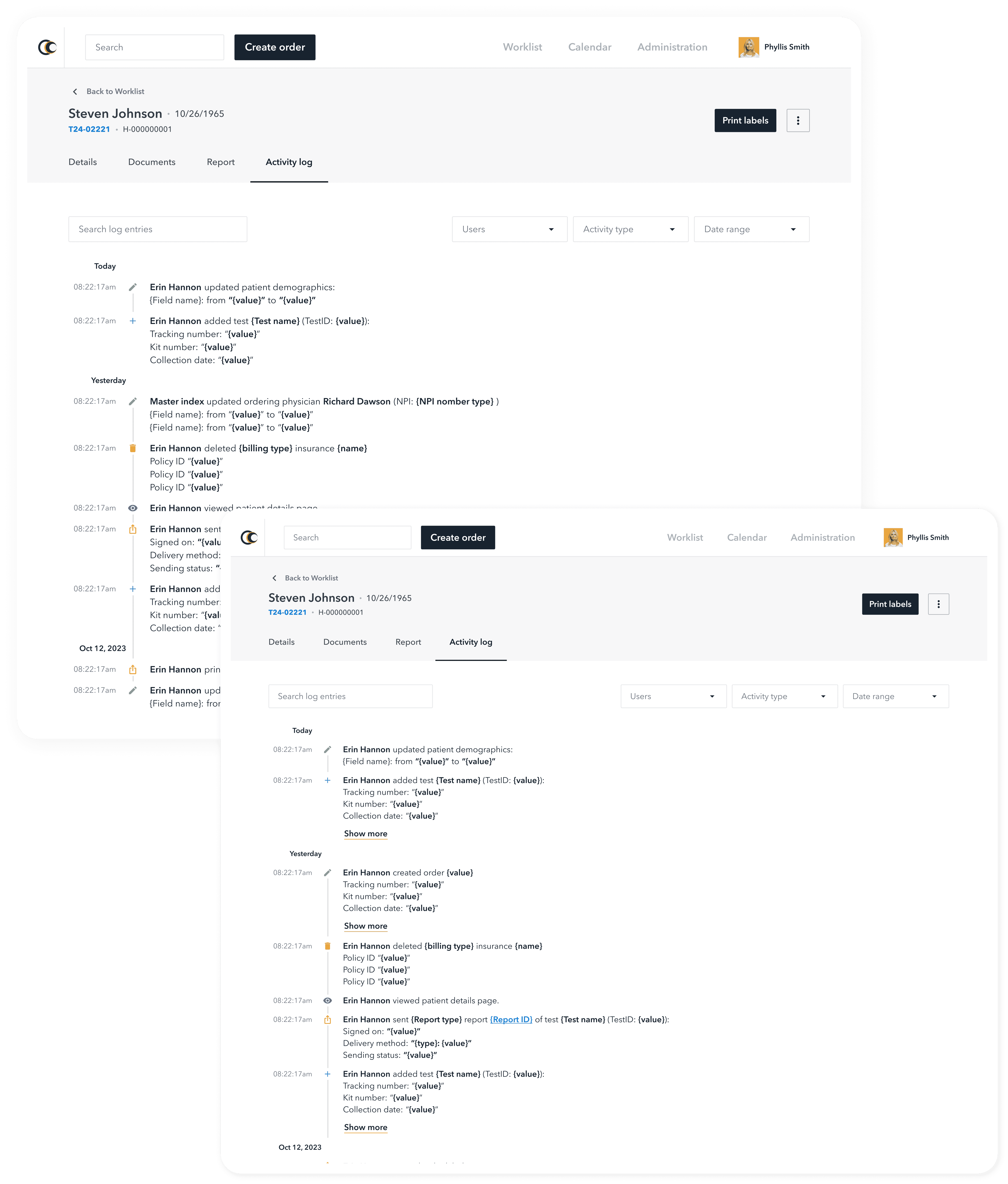
Developing a Design System for Healthcare Platforms, Reducing Technical Debt by 40%
and Improving Team Collaboration.
Problem at hand
Developing a clear design system will help both designers and developers work more efficiently.
My role
Design lead
My team
2 Designers & 2 Frontend engineers
Timeline
5 months, 2022
Tools used
Figma, Figma Token Studio, Jira, Confluence,
GitLab, Storybook
Overview
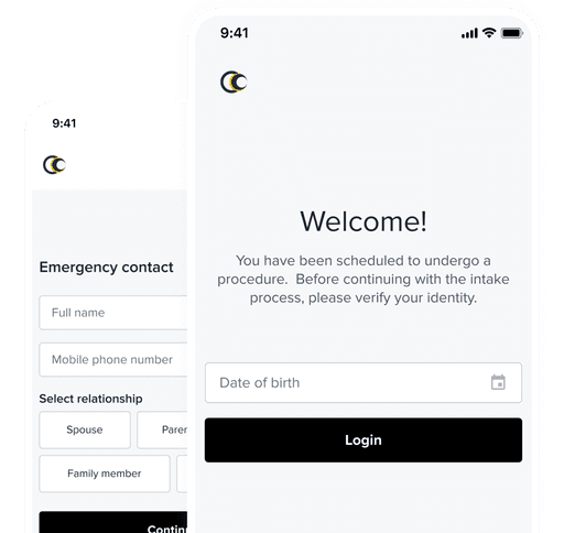
HALO Precision Diagnostics is a company that provides healthcare through advanced imaging diagnostics and genetic testing.
The Solar Design System is a flexible solution built for designers and engineers. It allows easy customization for both new and existing products while keeping a consistent look and feel. Designed for efficiency and adaptability, it streamlines the design and development process.
Problem statement
Streamlining design-to-development workflows while improving collaboration.
Design Consistency – Designers are still facing difficulties translating their designs accurately into the development phase. This results in inconsistencies in how the design looks versus how it functions.
Collaboration Gaps – Designers can’t easily test components, engineers provide late feedback, and developers face challenges finding the right components and verifying implementation, leading to errors and inefficiencies.
The roadblocks we faced
Establishing a shared language to improve communication between teams.
Guiding designers through the transition to the new system and ensuring they adopt it effectively.
Training engineers & designers to follow the system's guidelines consistently.
Adapting to a new system requires time and effort, which can be a barrier for both teams.
Migrating existing code to align with the new design system is labor-intensive and frequently deprioritized by teams.
The mission behind the design
Faster time to market: Streamlined workflows speed up product delivery.
Cost efficiency: Reduces redundant work and optimizes resources.
Consistent visuals: Ensures a cohesive design across platforms.
Reusable components: Saves time with pre-built elements.
Enhanced user experience: Delivers an intuitive and user-friendly design.
Scalable and flexible: Adapts quickly to evolving business needs.
Lower maintenance effort: Simplifies updates, reducing long-term costs.
What did we discover
Conducting in-depth research helped identify user needs, define key criteria, and establish a foundation for a user-centric and efficient design system
Before starting the development of the design system, I conducted in-depth research to understand the current state of our products and uncover key issues and user needs. This process involved analyzing existing layouts and designs, as well as actively engaging with our target audience. Through user research, conversations, and interviews, we gathered valuable insights into user expectations and requirements for the design system.
The research enabled us to define clear criteria and parameters that the new design system needed to meet. With a well-defined vision, we identified opportunities to enhance the user experience and improve product efficiency. These insights laid the foundation for the design system, aligning it with user needs and establishing a strong basis for future product development and continuous improvement
Defining the core framework
During the development of the design system, I crafted its architecture and defined the following key foundation guidelines and their purposes
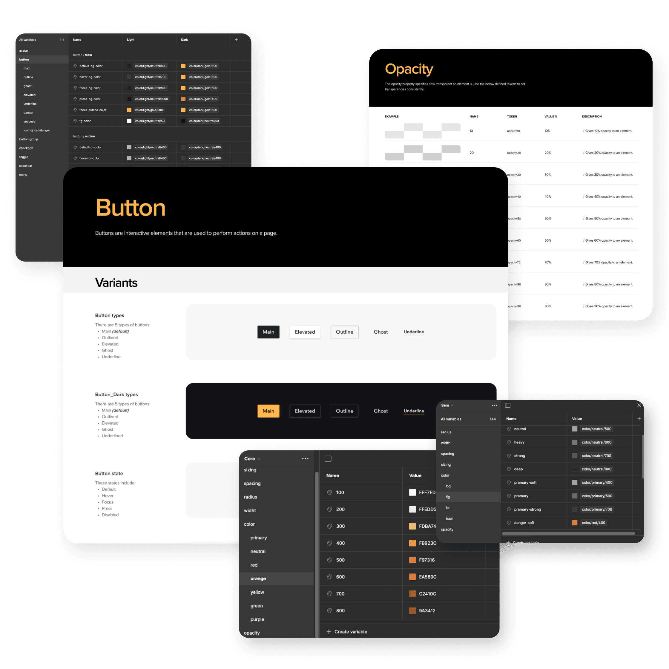
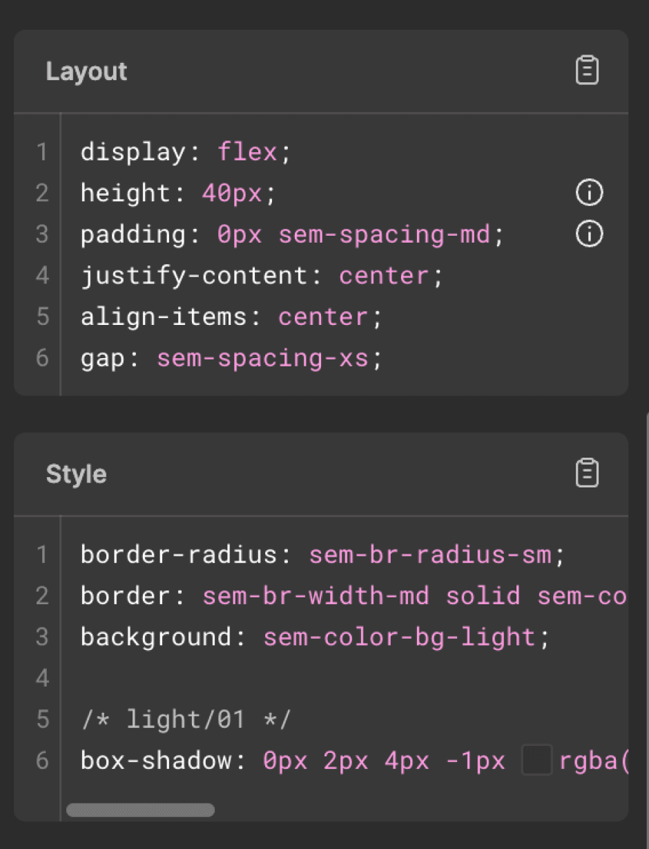
The building blocks of the system
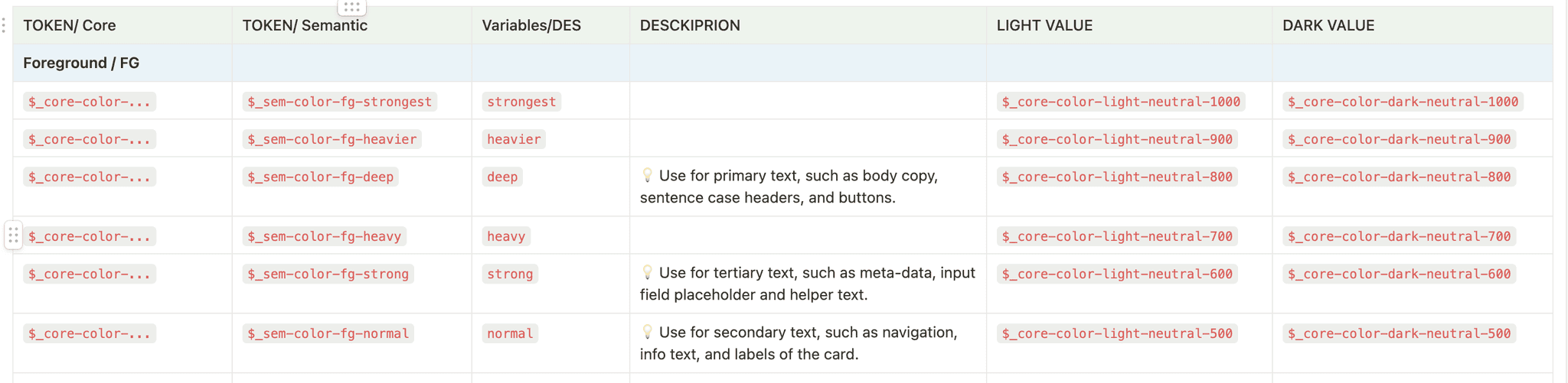
Tokens are separated into three levels:
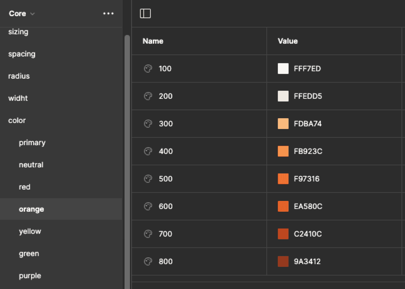
Core* – A token used solely to store a CSS value (e.g., 20px, #ffffff).
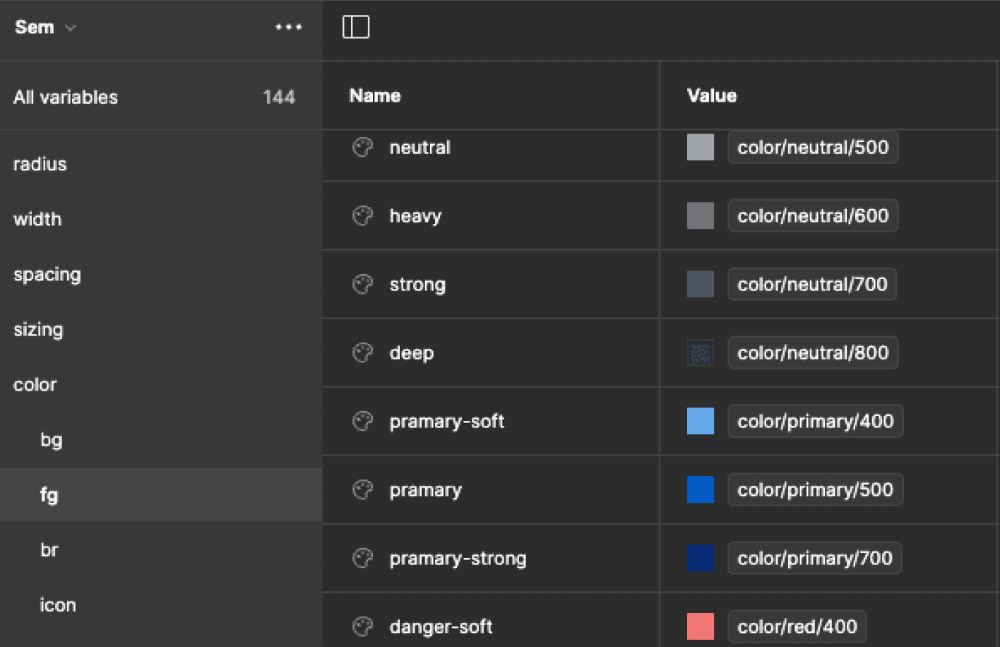
Semantic* – Assigns categorical meaning to a value (e.g., success-soft represents a light shade of green, small-border-radius means 4px).
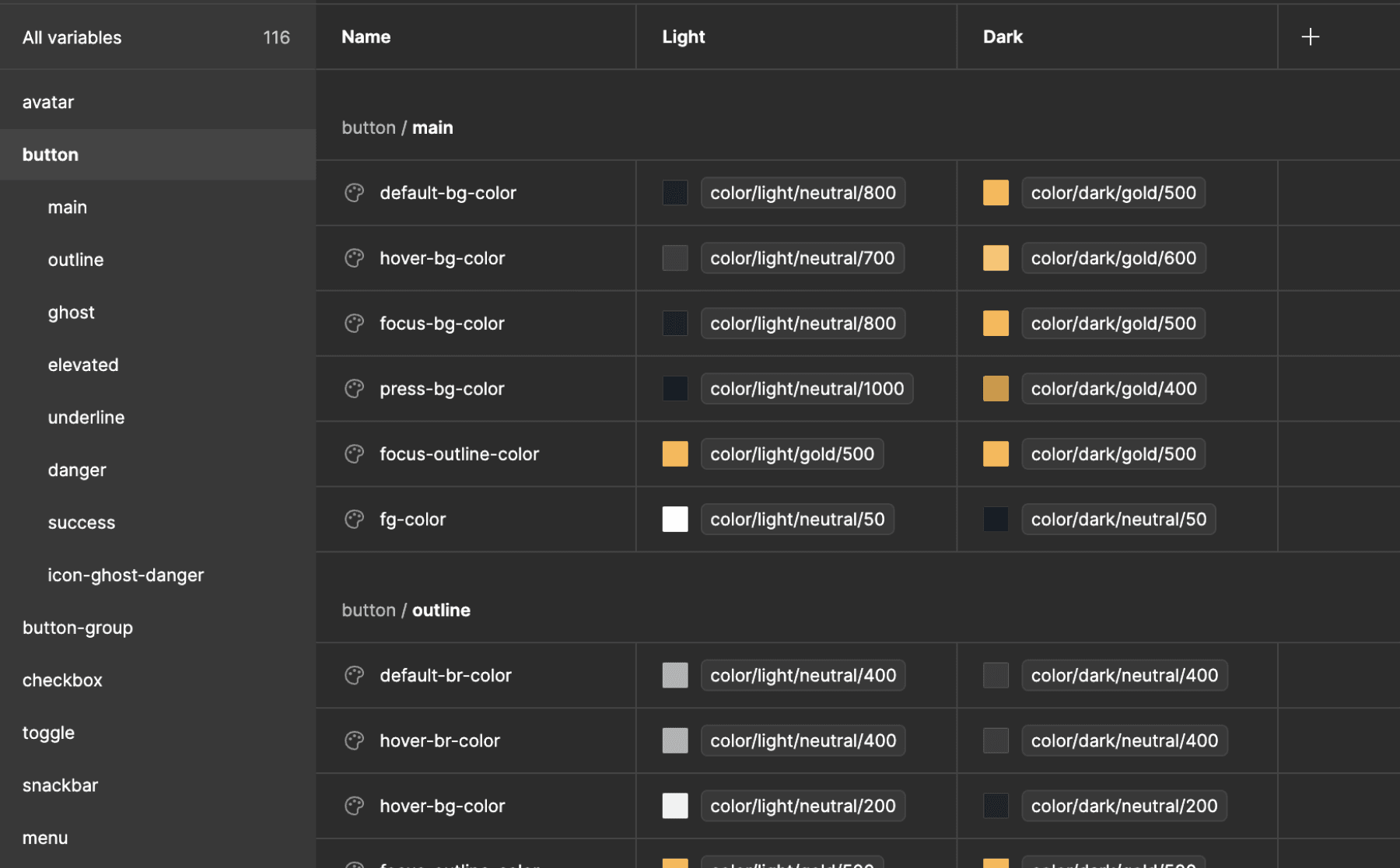
Component* – Defines a value specific to a component (e.g., an outlined button’s foreground color is strong-foreground, a disabled button’s background color is muted-background).
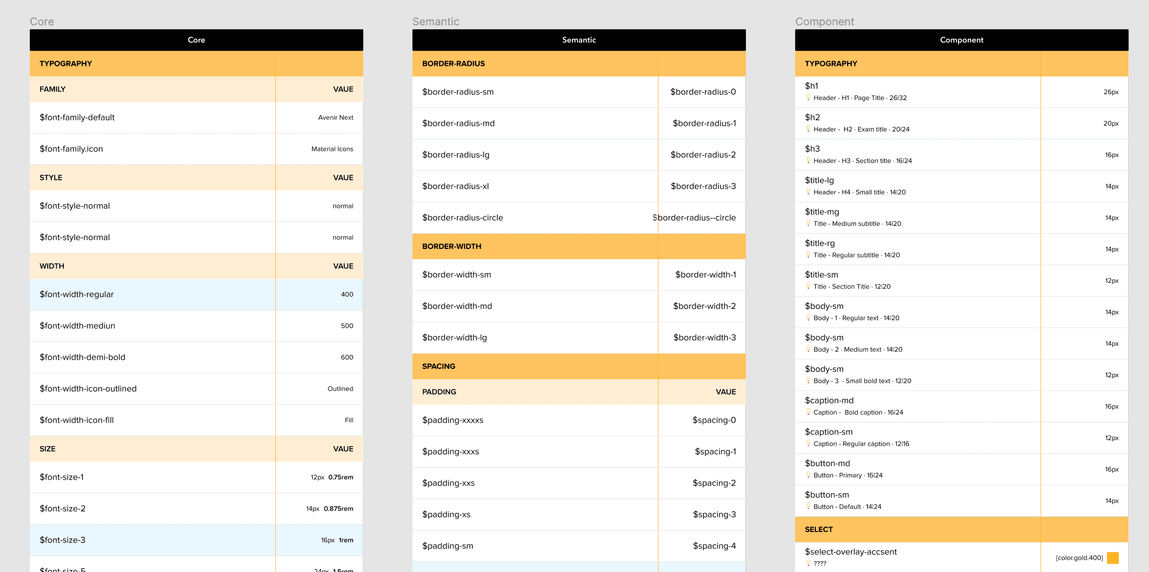
* However, the exact terminology varies across different design systems.
Core → "Base Tokens" or "Primitive Tokens", Semantic → "Alias Tokens" or "Meaningful Tokens", Component →"UI Tokens" or "Element Tokens"
Establishing the color identity
Developed a comprehensive set of colors that form the foundation of all our products. By defining the color palette, we ensured a cohesive visual identity and strengthened brand recognition across all platforms.
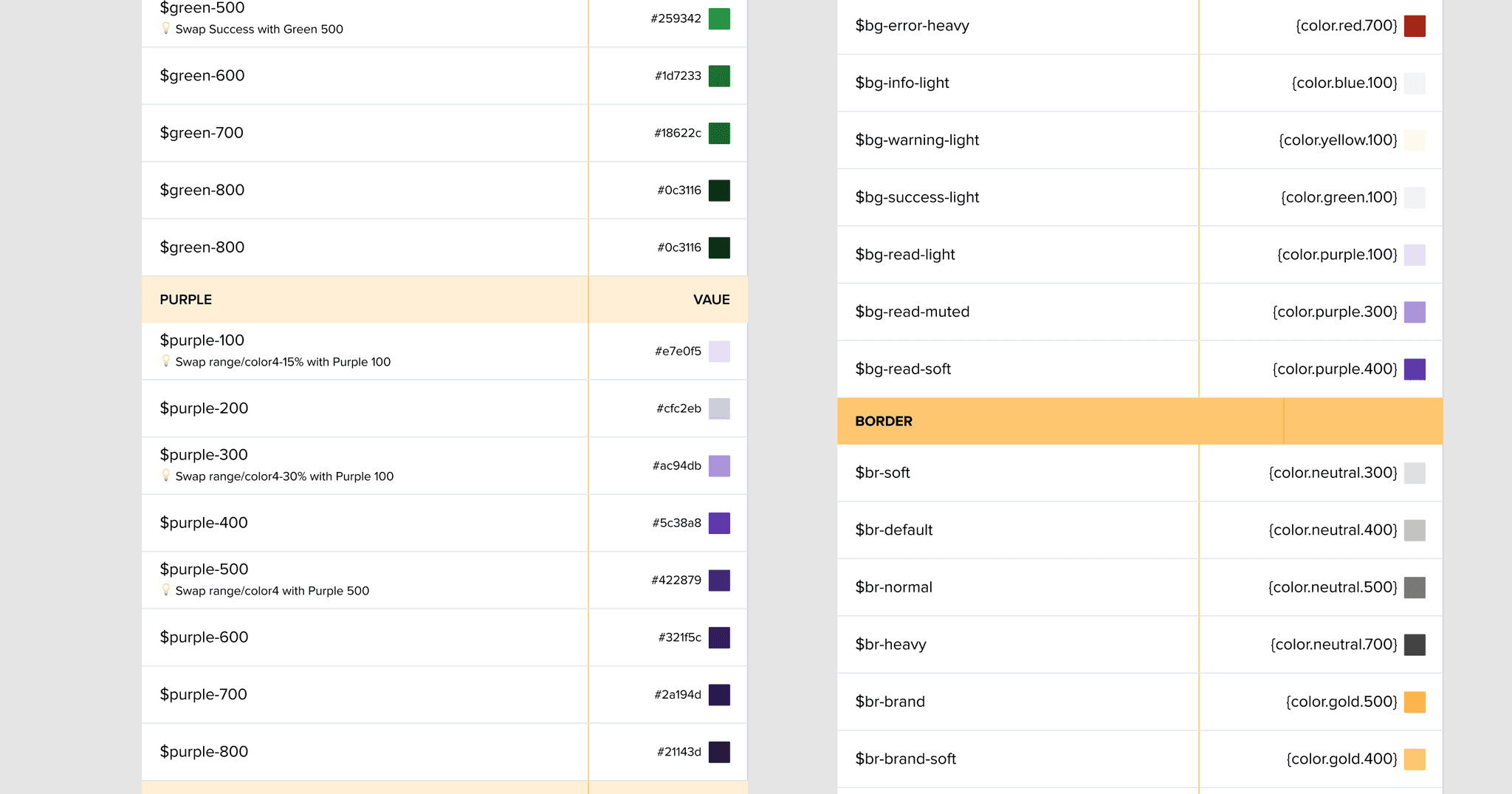
Defining colors with purpose & precision
Created a set of color tokens that were semantically assigned to various design elements. This development stage was challenging but exciting. Our goal was to create a compact and comprehensive set of variables that every designer can easily work with
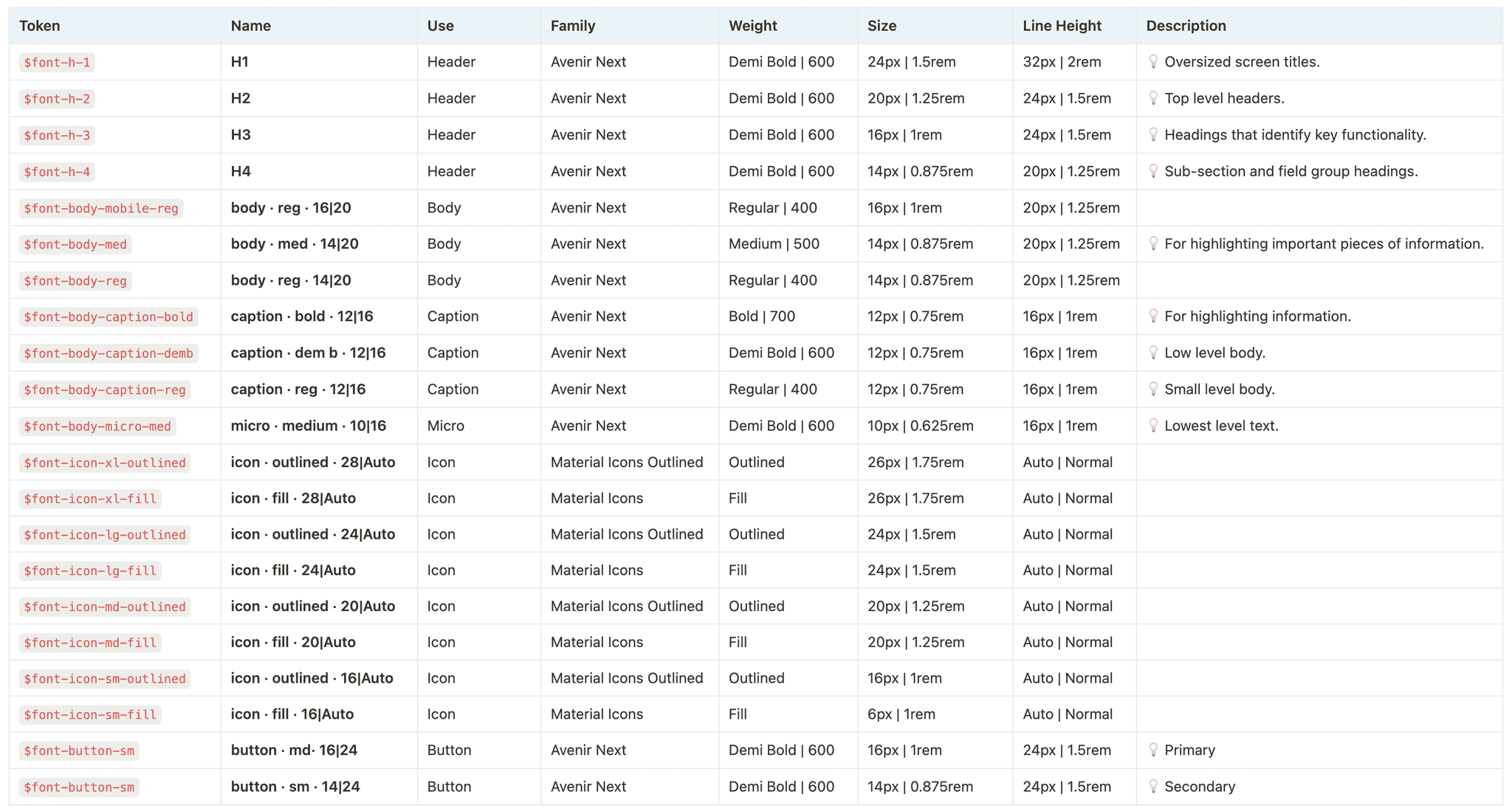
Scalable typography system
Defined a set of fonts and their usage in different contexts. For example, I established primary variables for headings and determined fonts for various textual elements in our products. This approach ensures the consistency and legibility of the text.
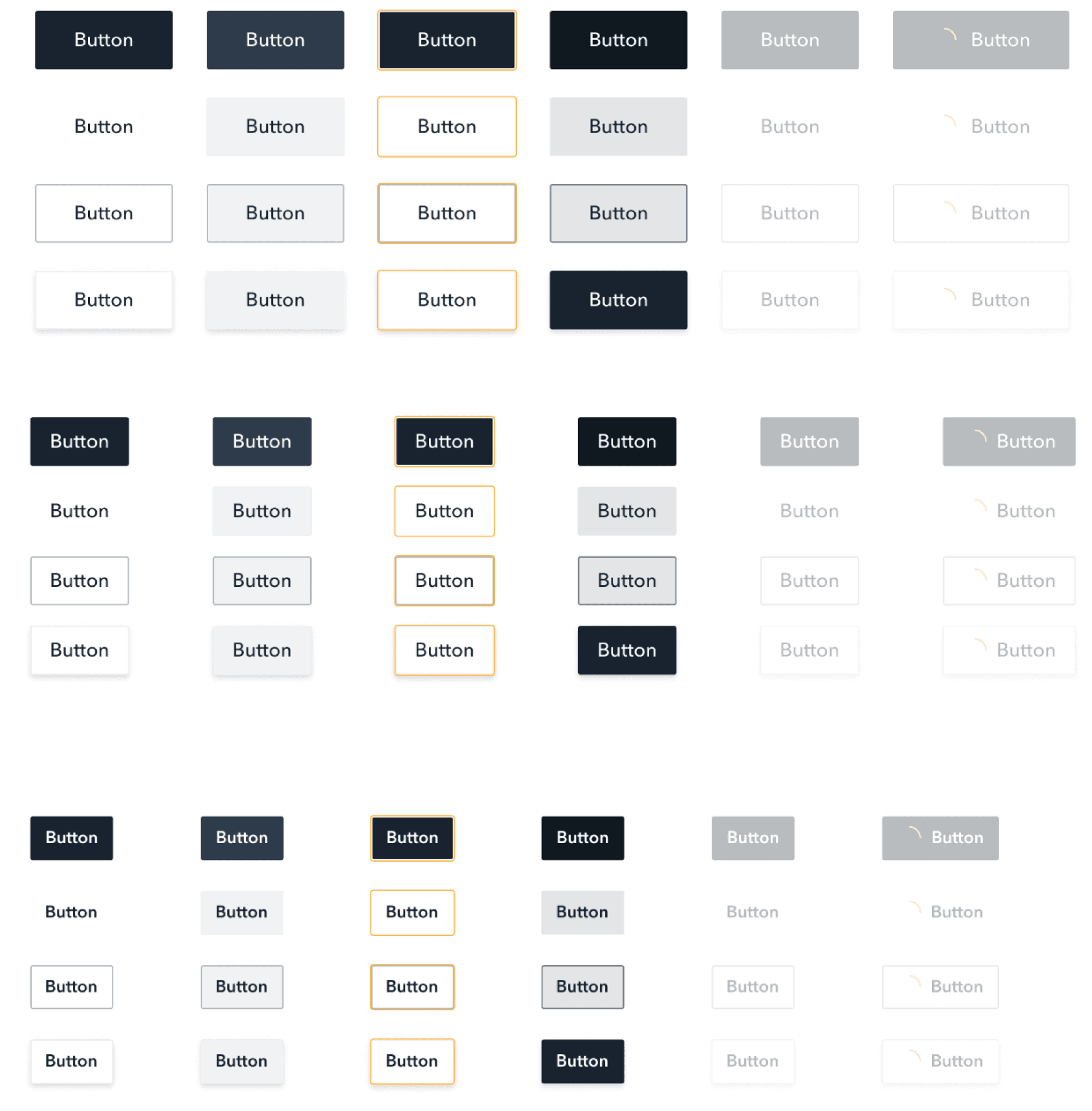
Key building blocks for design
The system will expand and be used by multiple users. Sticking to atomic design principles, using nested components, and simplifying variants with component properties helped me keep elements scalable.
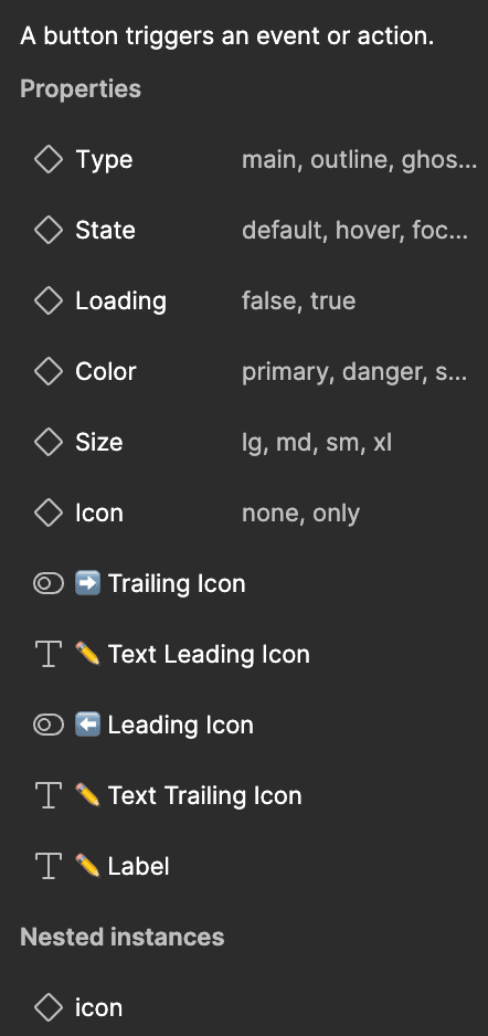
for Engineers
for Designers
From test to implementation
We tested the design system in a dedicated environment, integrated it into production, gathered feedback, and iterated to ensure high-quality, user-aligned components while optimizing development costs
We set up a special test environment for the team. Initially, we conducted internal component testing, but we knew that unexpected issues could arise in new usage scenarios. As a result, the primary testing phase focused on integrating the design system into the production environments.
We incorporated the components into the product, collected feedback from users and the team, carefully analyzed the data we gathered, and made necessary improvements to the components. This flexible approach helped us lower the development costs of the design system, but it required careful resource planning and team coordination.
It was vital to allocate enough time and resources to the integration stage to ensure the components within the products were high quality and consistent. Communication and feedback from the team and users were crucial in identifying issues and finding optimal solutions. This ongoing process allowed us to continually enhance the design system, meeting users' requirements and expectations.
The impact of our design system
With the implementation of our design system, we have achieved remarkable results and milestones.
Improved Productivity:
The design system streamlined workflows, reducing development timelines and accelerating time-to-market by providing consistent components and ready-made solutions.
Enhanced User Experience:
A unified design language and cohesive interface elements resulted in a more intuitive, user-friendly experience, strengthening brand recognition and trust.
Reduced Development Costs:
By eliminating redundant development efforts and leveraging pre-existing components, the system led to significant reductions in development costs.
Improved Collaboration:
Designers and engineers are more aligned, resulting in smoother project execution and higher-quality outcomes.
These results validate the design system’s value and foster better teamwork, driving both efficiency and quality. 🔥
The impact of the design system
The design system development project has had a significant impact on my career. We have streamlined the development process, improved collaboration between design and development teams, and worked together to enhance the user experience while strengthening our brand image.
Our strong partnership between design and development shaped the final product, and I learned a lot from their expertise and approach. 🙏
More projects
Screen size not supported yet
I am sorry but your current screen size is not supported.
Please switch to a device with a screen width larger than 1024px for the best experience.
Screen size not supported yet
I am sorry but your current screen size is not supported.
Please switch to a device with a screen width larger than 1024px for the best experience.