Designing an Online Intake Form for a Healthcare Company, Reducing Patient Check-in Time by 70% and Cutting Paper Usage by 40%.
Problem at hand
Patients face overwhelming paperwork during check-in, leading to inefficiencies and stress.
My role
Product designer
My team
1 Project manager, 4 Backend & 3 Frontend engineers, 1 QA
Timeline
6 months, 2022
Industry
Healthcare, medical software
Tools used
Figma, Confluence, Jira, Fullstory, Productfrouts
Overview
HALO Precision Diagnostics is a company that provides healthcare through advanced imaging diagnostics and genetic testing. Our solutions are making earlier cancer diagnosis and cancer prevention a reality.
Patients should be able to complete all their required intake forms for all their scheduled exams on their mobile device prior to visiting the center or on tablet at time of visit.
Defining the problem
Patients face overwhelming and inefficient paperwork at check-in, leading to incomplete information, stress, and repeated in-person questioning
Today, when patients check-in to imaging centers for an appointment, they have a large stack of paperwork to fill out, which can take 20-30 minutes. There is so much paperwork, in fact, patients get overwhelmed and often do not complete the paperwork fully. The front desk and tech staff have learned to cope with incomplete and inaccurate paperwork by asking the patient the same questions over again in person, multiple times, to confirm the answers. While the information collected does have a purpose, there is no reason the patient needs to complete this information while stressed out and anxious in the waiting room.
The pain points in patient intake
Time-consuming process: Patients spend 20-30 minutes filling out extensive paperwork, causing delays and frustration.
Incomplete or inaccurate forms: Overwhelmed patients often fail to fully or accurately complete the required paperwork.
Inefficient workflow: Front desk and tech staff must repeatedly verify patient information, wasting time and resources.
Patient stress and anxiety: The stressful atmosphere of the waiting room presents a challenge when it comes to completing the necessary forms accurately.
Setting the bar for success
Process: Create a streamline process for collecting patient information across the platform. Ease burden of completing focus for both staff members and patients.
System: Centralized from management built over a robust patient data model.
Data: Utilize all available channels to acquire patient information.
Patient experience: Use forms to drive patient engagement and collect data away from centre/physician office. Increase patient satisfaction of overall intake and consent process.
What did we discover
This research highlighted key pain points in the current process and provided a clear direction for designing a more patient-friendly and efficient intake experience
To better understand the current situation, I began by analyzing the forms patients are required to fill out during their visits to our centers. By completing the forms myself, I gained firsthand insight into the process and its challenges. Additionally, I gathered feedback from staff to understand their observations about how patients handle the paperwork and the common issues they encounter.

Convenience for patients
Our goal was to enable patients to complete the required information at their own pace, from the comfort of their home, without feeling rushed or overwhelmed. This approach ensures a smoother experience for patients. If they face any difficulties, they can save their progress and finish completing the forms at the center, reducing stress and improving accuracy.
Preparation & efficiency
By collecting the necessary information ahead of time, we can prepare in advance to address any patient-specific needs. This proactive approach allows us to contact patients if additional clarification is required, ensuring they are better prepared and their visit runs smoothly.

Defining the boundaries
Here is how we separated our work into 7 milestones for higher effectiveness
MVP was phase one:
Mobile + Tablet
Forms with appointment confirmation and reminder notifications
Revised authentication
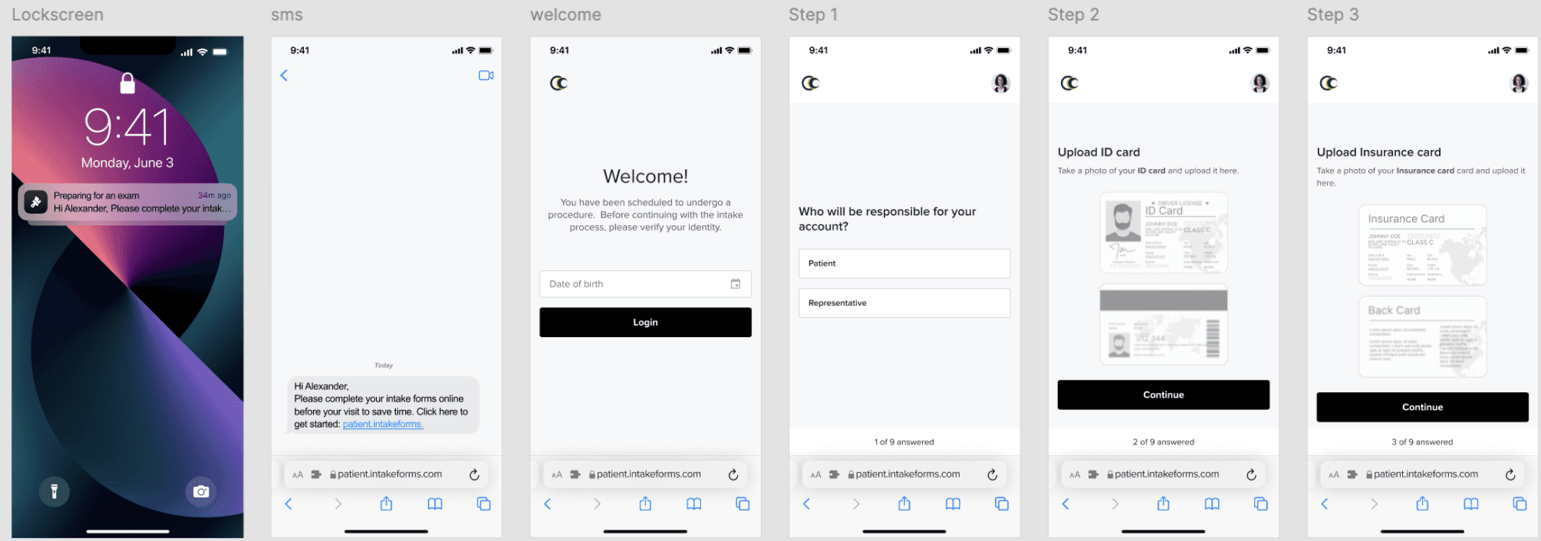
Document upload - Identity + Insurance cards
Emergency contact
Consents - Notice of privacy practices, Assignment of benefits, Treatment and communications, HIPAA release of medical records
Mapping the user’s path
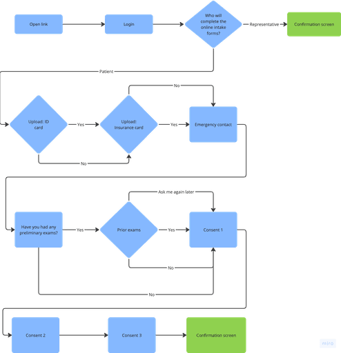
I aimed to optimize user efficiency by minimizing interactions required to achieve goals
User flow consists of two directions: one for the actual patient and one for the representative. This flow helps identify the main screens needed to achieve each goal.
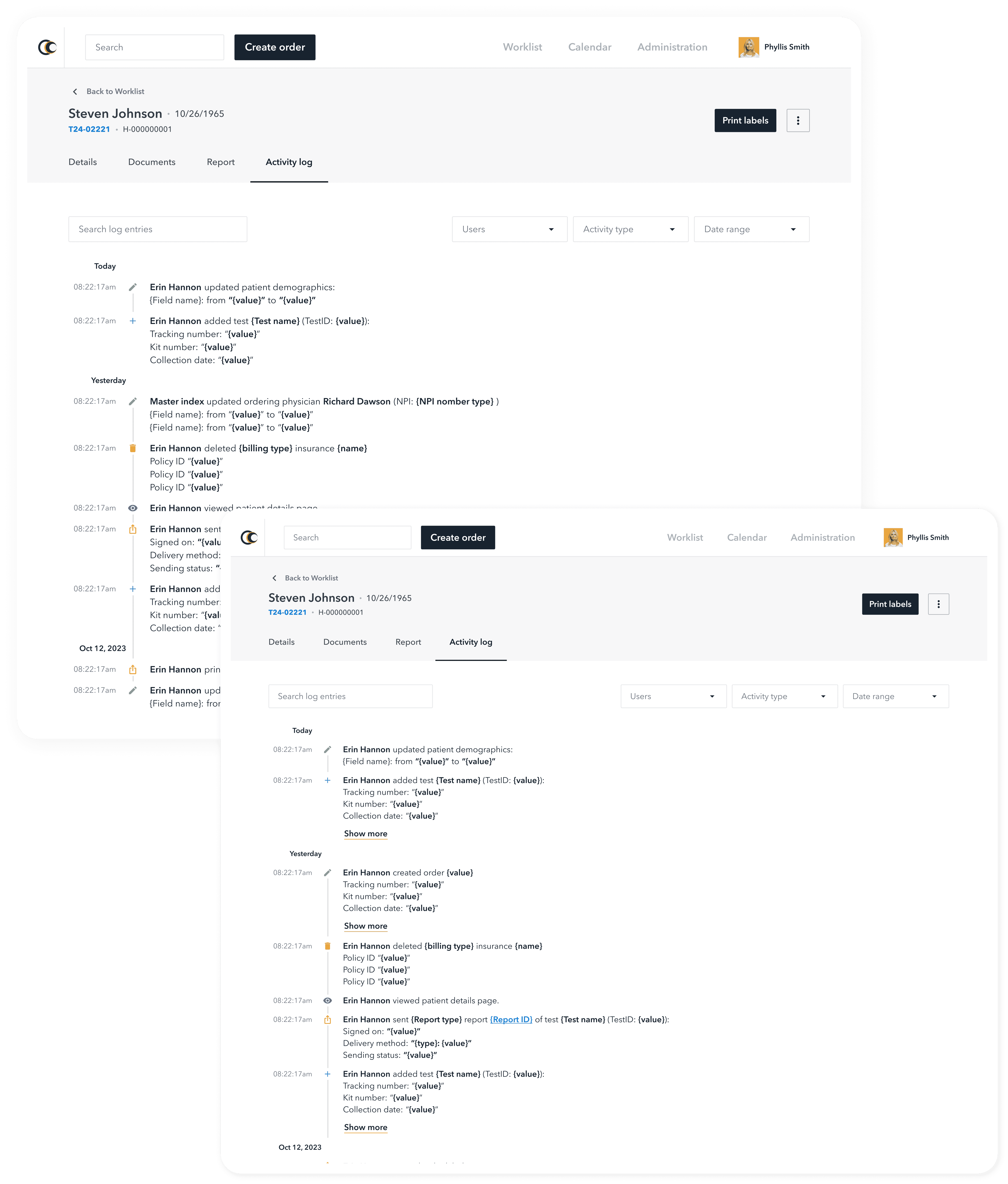
Implemetation
The final solution
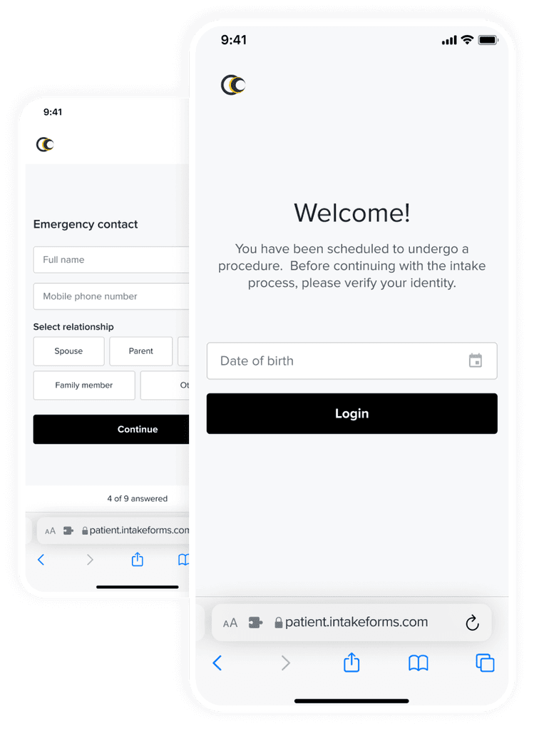
Patient login
To simplify the process for our patients, they can use a link to complete their forms. For verification we only require their date of birth. Through the link and date of birth, we verify the uniqueness of the patient and show him his forms.
Steps
After logging in, users will fill out 9 steps containing essential information for their placement in our center.
Consents
The last three steps in the forms represent informed consent, which each patient is required to read and sign to complete their forms.
A milestone in design & collaboration
The implementation of our new digital forms resulted in a 40% reduction in paper usage and streamlined the form-filling process, saving 70% of the usual time.
These successes lay a solid foundation for our next project: developing online forms for genetic testing.
More projects

Screen size not supported yet
I am sorry but your current screen size is not supported.
Please switch to a device with a screen width larger than 1024px for the best experience.
Screen size not supported yet
I am sorry but your current screen size is not supported.
Please switch to a device with a screen width larger than 1024px for the best experience.